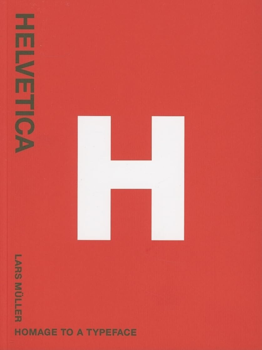
Helvetica: Homage to a Typeface
Desertcart purchases this item on your behalf and handles shipping, customs, and support to USA.
Description
Helvetica: Homage to a Typeface
Reviews
J**Y
The family book about the most boring typeface
This famous book is simply a little picture book and is great to take with you for a travel, or to offer to someone interested at art and visual art. Check also the "handbook" which is the same size and the same paper sold at the same publisher. Together they make a real couple and will please your grandson who likes art and his girlfriend who study in visual design. Or vice-versa.[...]
L**4
Five stars
This is a gift for a friend, but I had it sent to me. It arrived in perfect condition
N**Y
neat little book. handle with care.
It's about what you'd expect. I feel like I got my $20 worth, but as mentioned, it's gonna fall apart before you're halfway into the book. I think if I would have heeded the warnings it may have gone a little farther. Your mileage may vary.
K**A
Great book
I love this book. Although i has a poor binding and it's kinda small ( i expected bigger book) i really love it. It has a lot of pictures with usage of helvetica.
S**N
Must have for any typeface lover!
Perfect visuals of a perfect typeface. A must have!
B**C
Five Stars
Awesome!
D**S
Just OK......
I thought the book was going to be bigger! It is like a pocket book! It is just OK, nothing spectacular.
R**N
It's no Akzidenz
First the mystery: just why was every alternate page in the book joined together? The reader has to carefully cut the perforations to be able to look at every page. I can't find any reference in the small amount of text about this. My conclusion is that the public use of the type is on the open pages and non-public (or designed) examples are on the perforation joined pages. At least you'll know if you buy a pre-used copy though.Apart from the perforations I thought this was a handsome little book and homage in the title is very apt. Helvetica is probably the world's number one communication choice, it works just as well on a municipal sign or a new baby announcement. Before it gained a monopoly each nation seemed to have its own jobbing type, Franklin Gothic in America, Gill Sans in England or Antique Olive in France, for instance but the super clean lines of Helvetica (and computer typesetting) meant it was no contest for all the others.The author mentions the uniqueness of Swiss design in the Fifties partly because the top designers always used the same typeface, the stunning Akzidenz Grotesk, which fitted into their rather austere but elegant graphic solutions even though it only had two weights, Medium and Bold. Who needs italic, extended, condensed, extra black and the other weights to communicate efficiently? The rest of the world for a start. From the late Fifties Swiss designed Helvetica spread across the globe and you'll see from the hundreds of examples in these pages some wonderful design solutions, especially the two hundred plus logos that use the face in all sorts of variations. As a typeface there are probably a few dozen Helvetica weights now available. Incidentally, the author suggests that Arial, the default type used on Outlook Express for most emails is a digital Helvetica, close but no cigar! The most obvious differences are the cap G and the lower case s and t.'Homage to a typeface' is a lovely book that'll interest most typographers and anyone who is curious about a lettering style that seems to be everywhere.***FOR AN INSIDE LOOK click 'customer images' under the cover.
G**N
Beautiful book
Really lovely book, made an excellent present
M**G
Helvetica: Homage to a Typeface by Lars Muller
5 stars au caractère 5 stars.Il s'agit d'un petit format agréable pour une Histoire sous forme de promenade.Aucun parti pris, simplement une ballade citadine que les amoureux de la typographie apprécieront.Un caractère sans caractère ? Bien sûr que non. Son dessin est juste, c'est maintenant, au rôle du designer de lui donner une âme.Ce produit m'est arrivé en excellent état et conforme au descriptif annoncé : respect du délai, qualité de l'emballage, etc.C'est un livre à offrir à tous vos proches sensibles à ce que représente la signe : la couverture se suffit à elle-même.Une adresse à recommander ! Mille mercis.
S**S
Un omeggio al carattere più famoso!
Un piccolo (nel formato) libro dedicato all'Helvetica, una delle font più famose e usate al mondo.La parte di testo è piuttosto ridotta ma esaustiva, predomina infatti quella di immagini relative al design e alle applicazioni dell'Helvetica.Un libro che non può mancare nella collezione di ogni graphic designer ma che è molto interessante anche per un semplice appassionato di design come sono io.L'unica pecca sono le dimesioni del volume: un'opera di questo tipo meriterebbe una formato molto grande, ma comunque ero consapevole di questo al momento dell'acquisto.
G**.
OBLIGATORIO.
Un libro obligatorio para diseñadores gráficos y todos los amantes de la tipografía, concretamente de la HELVETICA. Si queréis hacer una biblioteca propia de diseño, este libro no puede faltar en ella.
K**S
the best
good quality, quick and reliable vendor, thank you very much, i am totally satisfied either with the product an the delivery
Common Questions
Trustpilot